The start of a new business venture is an exciting and busy time, as well as a labor of love. All successful businesses begin as just an idea, but it takes the right mix of dedication and execution to bring them into the world. If you have an idea for a new business, following these 5 steps will help bring it to life.
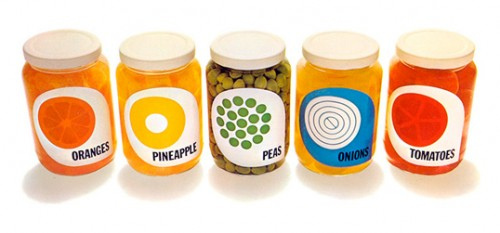
1. Put the Concept on Paper Some might call this creating a “business plan” but that term can feel a bit off putting. I prefer to think of it as a big note taking session where you’ll list off all of your ideas for your new business and how you potentially see them coming to life. Seeing your idea spelled out on paper can give you a deeper sense of whether the timing is right or not, and if you are truly willing to put in the hard work required. Be sure to list off all the ideas you have, including the roles everyone involved will play, and who will be responsible for what. When we started Wholesome Chow, my business partner and I never wrote a business plan. We thought we knew what we wanted to offer, but after trial and error our business went on a completely new path then the one we had originally started on. This cost us a lot of time and wasted resources (buying a ton of equipment that we never ended up using - yikes!). If we had really thought through our business before investing so much we would have saved ourselves quite the hassle. 2. Research the Market Market research is the most important step when starting a business. How will you know what your potential customers will want or need if you don't get out there and start asking? If your business has a physical location or storefront, scope out the potential competition, customers, and traffic in the area. If your business is solely online, research the same basics through Google. Be sure to ask your friends, family, and acquaintances if they would use your service or product. Knowing why they would or would not, and how they would make any modifications, will help to guide you. If you research your competition and find there are many other businesses offering what you want to offer, consider modifying your plan to specialize in something more specific to your area of expertise. 3. Invest More Time, Not Money Money is a valuable resource when starting a business. Be sure to make purchases wisely and with thorough research before you pull out your wallet. It’s best to tap into all of your resources which do not require you to spend money before investing actual funds into your business idea. Once your concept has legs, and you feel confident in your idea, then invest finances into equipment, etc. Throwing money at a business does not guarantee success. Time, energy, and research are more sustainable resources for a long lasting and lucrative business. 4. Start with a Small Test Market Test your idea in a small market, preferably in your local area. This will help you work out any kinks before you commit to bigger endeavors. If your test market falters, consider modifying your plan and thinking outside the box to see where you could improve. Before expanding to other regions, it’s best to have a secure presence in a smaller market. Wholesome Chow started off by selling gourmet, organic food at several of our local farmer’s markets. It was at these markets where we noticed our Organic Gluten Free & Vegan Chocolate Cake was a big hit. Customers came weekly to grab a slice and it was here that we realized there was a big need for gluten free products, especially baked goods and baking mixes. Our entire baking mix line was created because of this accidental market research, which cost us nothing! 5. Work as Often as Possible The best time to start a business is when you are ready to fully commit to it. You are the only person who can make your business dreams come true -- no one will do it for you. Get out there and make it happen! Tell the world about your business, brand yourself and make your business one of your top priorities. The first few years after starting Wholesome Chow, my partner and I worked about 8-12 hours almost every single day to get our brand off the ground. This included website development, product research, sales calls, answering emails, finding new customers, talking to store managers, mixing and packaging products, and much, much more. Had we not put in this crucial time and energy, Wholesome Chow would not be as successful as it is today. Learning the basics of graphic design will help you create stand-out posts for your Facebook page, spread the word with engaging blog graphics and generate pinnable content. 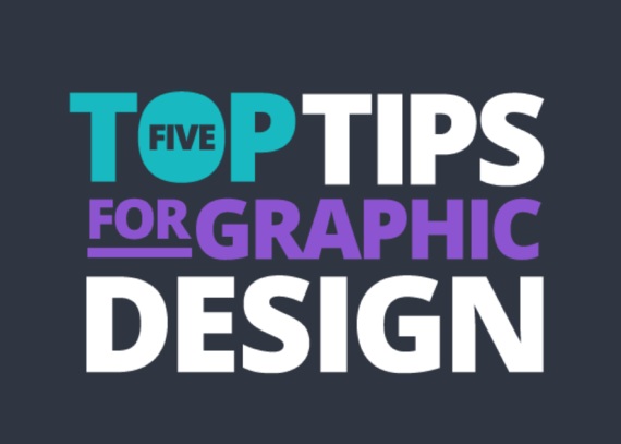
There are a few fundamental rules which will help you to create professional looking designs. These five simple tips will have you creating amazing blog graphics, social media posts and marketing materials in no time. Design tip #1: Use contrast to help your designs stand out 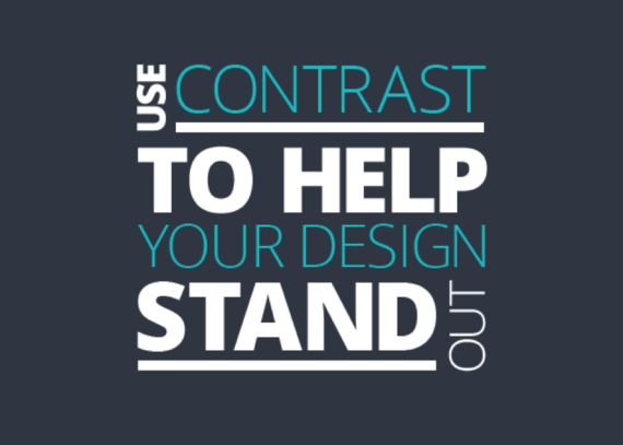
The best designs stand out. One of the simplest ways to make your design jump off the page is using contrast. Choose colors that contrast well. If you have a light colored background then use a dark font. Design tip #2: Choose your font palette 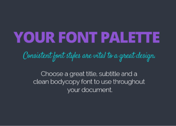
Does your company have a standard brand font? Choosing a consistent font palette is a fantastic way to ensure consistency and to build familiarity with your customers. Try choosing a heading font, subtitle font and body text font. Pick a bold font that stands out for your heading, and simpler subtitle and body fonts. Design tip #3: Pick a color scheme 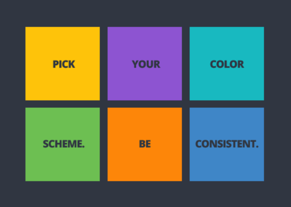
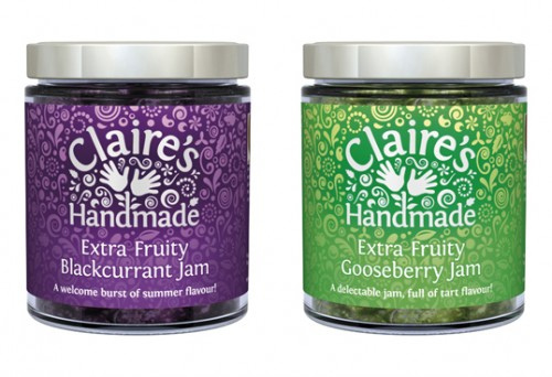
Next step when it comes to design, is to choose your color scheme. Is your brand fun and fresh, or established and trustworthy? Choose colors that reflect this 'brand personality'. Start with 2-3 main colors and build from there. Use these colors consistently. Design tip #4: No naked images 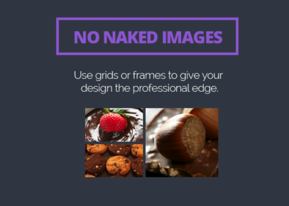
Images are a key part of graphic design. It's actually very simple to get a professional look. The key? Use grids or frames wherever possible. By adding some order to your images, your designs will be looking better in no time at all. This is a simple trick which will give your design a professional edge. There are hundreds of grids to choose from in Canva. Design tip #5: Keep it simple 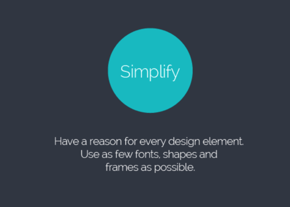
Lastly, it can be easy to get carried away with so many great images, graphics and fonts to choose from. Simple is always best when it comes to graphic design.
Reducing clutter means you're more likely to get your message across! Make sure you have a reason to use every design element, and keep the number of fonts, colors, shapes and frames to a minimum. Graphic design is a very wide domain and getting a job as a graphic designer is not an easy task. Besides the many skills you will have to learn, getting a job on the web also requires personal attributes such as resistance to stress, creativity and self-motivation. But before your personal skills will be evaluated, the practical ones are the first to be looked at; and the most important, obviously. Therefore today we start a short series of articles in which I will talk about the basics of graphic design. Today we review the most popular elements of the industry. The main job of a graphic designer is to design visual elements for the web and print, such as layouts for websites (which are most of the time “translated” into real websites by the web designers), posters, brochures, flyers or advertising campaigns (both in web and offline). There are in total six elements of a design which you need to be aware of: the line, the shape, the color, the texture, the value and the space. 1. The line The line is usually present in every design, even if it is a solid border of 1px or a dotted one of 5px. Every website has lines, but the minimalism style which became more popular in the past couple of years tries to erase the lines from the layouts, or at least to decrease the use of them. The lines can be long, red, straight, thin, blue, dashed, short, black or curved, they are all into the same category. They are most of the time used for delimitation between different sections of a design, or are used to direct a viewer’s vision in a specific direction. The lines can create different effects and visual impact. While a thick, bold line draws attention because of its visual power, the thin lines tend to go the other way. The color has an impact too, dark colors are easier to see and draw more attention than light or pale colors. And this is not all. The style of a line can also influence the way the user sees it. This style can easily be defined through CSS and can be solid, dotted and dashed among others. The solid lines have a different impact than the dotted ones, because they are more imposing. The minimalism style which I've talked about earlier uses either less solid lines or more curved lines, because they give a dynamic and fluid look to a design, which is also the purpose of the style. They indicate energy, keep the user interested and, if combined with illustration, are very powerful to the human eye. Many years ago solid lines were very popular because they determined the style of the design: rigid, solid and organized. The web changed in the past years and this style is not very popular anymore, especially for designers’ portfolios and other pages with a strong need of a personal touch. 
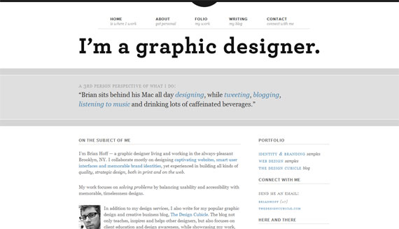
The lines separate the two columns and are not very bold. The solid lines are used to separate different parts of the website.
2. The shape The shape, or the form, is the second most used element of a web design. They are actually lines combined in different shapes. The forms are still popular and this is because if there is something that needs to stand out, forms are one of the ways to do it. There can be circles, squares, rectangles, triangles or any other abstract shape; most of the designs include at least one of these. Minimalistic designs use it a lot, because they are often based on illustrations and drawings. The old style of designing websites included shapes too, so they remained popular throughout the time and will probably continue being like that. Like lines, shapes are also associated by the human mind with different movements. For example, circles are associated with movement and nature, while squares are often seen as structured, basic designs. Just like with the lines, the color, style, background or texture of a shape can totally change the viewer’s perception. 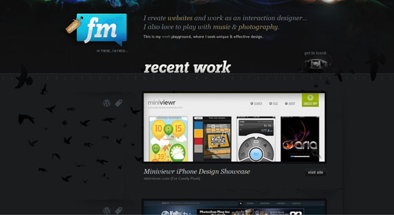
Fred Maya's portfolio uses shapes to emphasize the logo and the previous work.
3. Textures The textures were not very popular a couple of years ago, but they tend to become more and more used. They replaced (or compete with, if we can call it a competition) the single-colored backgrounds. Textures can look similar to solid background colors, but if they are analyzed closer, small but effective differences can be noticed. Texture styles include paper, stone, concrete, brick, fabric and natural elements, among flat or smooth colors. Textures can also be subtle or pronounced and can be used sparingly or liberally. They work with pretty much everything. Even if they do not seem important, the textures can totally change a website and offer a totally different visual impact. 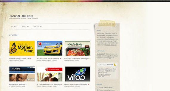
Jason Julien's portfolio uses a grunge texture.
This webpage uses a different texture than the first example, looking like a math notebook.
4. Color The color may even be the most important element of a design, because it offers the most powerful visual impact at a single glance. Color is obvious and does not need basic graphic skills to be noticed. While lines and shapes mean the same thing as in the reality, only at a little more profound level, the color means exactly the same thing as in the nature. Color creates emotions – red is passionate, blue is calm, green is natural. Even if you don’t realize this, colors have a clear effect on your mind. Studies have been done and a person who lives in a red environment has a higher heartbeat and pulse than a person living in a blue environment. The human brain sees this and influences the rest of the body. Therefore color theory is very important to know, because not many designers can call themselves experts in this field. Being a master of colors might make the difference between a good design and a stunning one. I am not saying you have to know all of them, but knowing how hue, saturation, shade, tint, tone or chroma work together is crucial for a graphic designer. 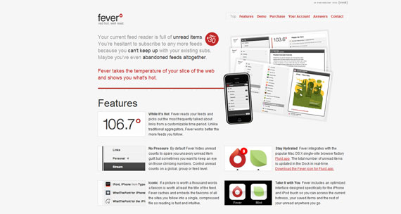
Feed Fever uses different colors for text, trying to emphasize the importance of each line with a different nuance.
5. Value I did not specify value above, even if it is closely related to color, because value is more general and represents how dark or light a design is. Value has a lot to do with mood too, only at a more profound level. Understanding colors will take you close to perfection, but knowing how value works will take you beyond this. Lighter designs offer a different impact and feeling than the dark ones and you need an expert eye to notice differences and decide which one is the best. 6. Space The space and how it is used is crucially important in design. Lately the “white space” (also called negative space) became used widely because it allows the human eye to read easier. For whoever is not familiar with the term “white space”, it does not mean precisely space filled with white, but every area of the design which is only filled with the background color. You can see several examples below to better understand the concept. If there is a lot of negative space in your web design, it offers light and an open feeling. The lack of white space will turn your design into an old-fashioned, cluttered one. The space has also a lot to do with how the design is perceived by the human eye. Even if I said the color is maybe the most important element of a design, the space is definitely present in the top, because it is also very easy to notice by the untrained eye. It can turn a design to your advantage and get the best out of your layout. 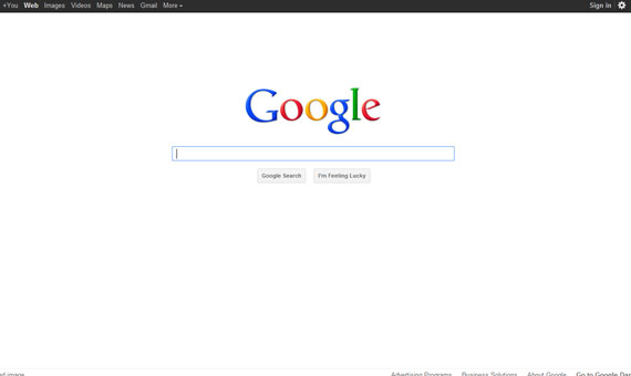
Google is the best example on how the negative space can be maximized.
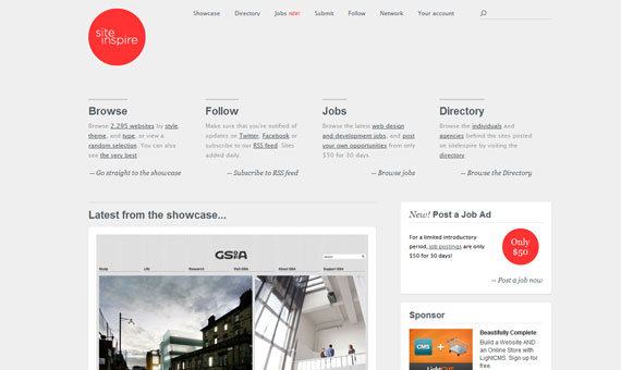
Site Inspire also uses the negative space on the sides and combines it with a well-suited typography.
Conclusion
These are the basic elements a beginner graphic designer should know about. Having this knowledge will allow you to think more user-focused and design with a better style. However, this is not everything. A couple of more articles will complete this series and the following one, due to come very soon, will talk about the principles of design.
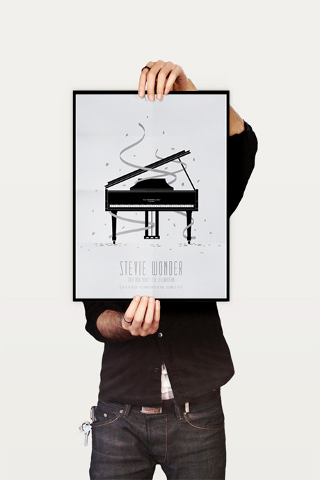
Cool Poster Designs By Benjamin Garner Benjamin Garner lives in Austin and has for the past 7 years. “My design style is a mix of simple, clean and modern elements with hints of retro chic. Illustrations and Logo design have become my forte with concert poster design being my biggest love (and most of my favorite work).”
A business card is a first impression in a business meeting and a reminder of that person's creativity or skills on the long run. Here is a compilation of some of the most creative business cards. 01. This business card by G-Man, Great Typography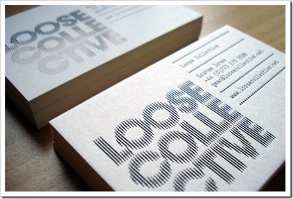 02. Agency: Actual Size Creative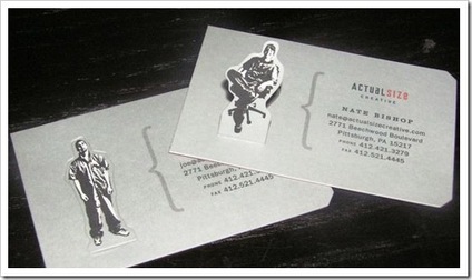 03. Fifth Floor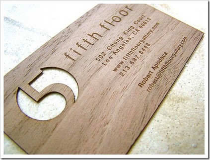 04. Philip Lester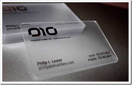 05. Amaze Entertainment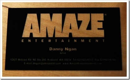 06. Austin Walsh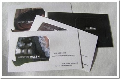 07. Tania Hannaford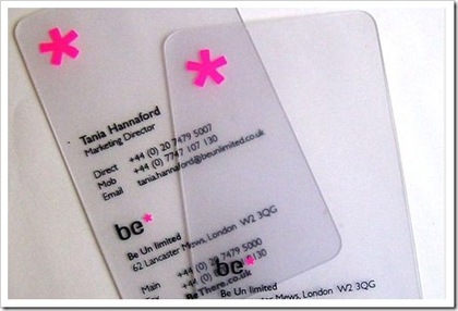 | Favorite LinksAuthorWorks as a Graphic Web Designer. I'm fond of everything that falls under the term "Art." ArchivesNovember 2014 CategoriesAll 
The Codedesign
|


 RSS Feed